

GUEST POST: Dual Coding to Support Inclusion
By Oliver Caviglioli

Oliver Caviglioli, @olivercavigliol, is a former special-school head of many years, who later on in his career turned to visualization. Oliver has worked with us on various projects – most notably, the 6 effective learning strategy posters. You can read our interview with Oliver here.
I recently presented at the Derby College Showcase conference, whose theme was inclusion.
Overview
It was easy to place the value of visual communication in the theme of inclusion. I started off with two exercises to immerse the teachers into what it feels like not to understand seemingly simple communication.
The first activity I took from my days of presenting day-long INSET (teacher training) courses on visual teaching techniques. It involves me explaining a concept that I show, piece-by-piece, on the whiteboard, helping to build up understanding. However, only half the audience are able to see this visual counterpart to my oral presentation. The other half have their backs to the board and have to process and store all of the incoming information.

And, that, in essence, was the main point of my presentation — that spoken information is transient. During my previous life as a trainer I used to make this point, but I had no evidence, or indeed language, to back this up. All I had was the teachers’ own experiences. But without authority to back up their insights, I can only imagine that this interesting insight simply fell away from their memories the following day.
Last week, while studying John Sweller’s magnificent Cognitive Load Theory book, I came upon an explanation of this phenomenon. It’s called the Transient Information Effect.
Whenever a teacher orally explains something to a class…the information presented is transient. -- Sweller et al. (1)
The Transient Information Effect
Here is the concept that I explained to the teachers, only half of whom saw the supporting visual build up (the other half had their backs facing the screen). As you can see, the content I explained was about retrieval practice. It is presented here in the form of a concept map that I created in partnership with Megan and Yana (see this blog post for the original concept map and a discussion of how it came about).

After demonstrating the transience of spoken communication, I then moved on to what should have been a simple solution — the use of the written word. While this is the proposed solution put forward by John Sweller and his fellow authors, there still remains a problem with text-only approaches.
Combining Text with Graphics
Elsewhere in the cognitive science evidence, there are many experiments showing that text-only communication can be less effective than a text-and-graphics strategy (2). The following activity showed why that should be so.
I presented the teachers with this very simple, and short, description of the personnel in The Lasagna Project (3). Despite its brevity and simple vocabulary and grammar, very few of the teachers were able to answer the three questions below the description.

But, when the corresponding visual was shown, the answers became self-evident.

The combination of these two activities was — to my thinking — obviously highly significant to the issue of inclusion. But, given that the trainee teachers had trouble, too, with these activities, the transience of spoken communication and the complexity of written communication can’t be considered solely as problems for low-knowledge students.
As the presentation continued, I argued that these psychological constraints were pertinent to the professional learning of teachers themselves.
After running the Transient Information Effect activity, I proposed a solution in a second activity by asking the teachers to answer questions based on a simple piece of text. As anticipated, they found this difficult – until, of course, I showed the same information depicted in a diagram.
Here are two quotations that, to some degree, both explain their experience. I still find the Bertrand Russell’s explanation most compelling.
“People learn better from graphics and words than from words alone…you can help people learn better if you include appropriately designed graphics in instructional presentations.” -- Richard Mayer (4)
“Languages are sequential in nature, and so must have a compensatingly complex syntax to express certain relationships.” -- Bertrand Russell (5)
Organizing Visual Information
Just “going visual”, however, is insufficient. Pretty much most education strategies have both disadvantages as well as advantages. The danger with using visuals is in using distracting, attention–sapping decorative images that have nothing to do with the concept at hand (see this blog post for more on when too many pictures become too much of a good thing).
At best, visuals should help organize the information (as we saw in the Lasagna Project activity). Organizing information is crucial in helping students encode it into their long–term memories. However, as Reif warns us (5), students are not very able in doing this.
“Poorly organized knowledge cannot readily be remembered or used. But students don’t know how to organize their knowledge effectively.” -- Frederick Reif (6)
This is not surprising if we remember that students are novices in the context of the material they are learning. So teachers must organize the material for them. This accords with Sweller’s view that learning consists of borrowing information, already organized, from others.
The two following slides come from the Further Education section of the special school at which I was head teacher. You can see that the teacher has organized information about the topic she was about to teach; the information is nested.
In the first slide, note the outer branch circled — hygiene.

Now look at the following slide, and see that hygiene is now in the center.

Now, return to the top slide and you can see how the second slide that expands on the hygiene topic could be drawn on its borders. Similarly, every other outer portion of the slide could be expanded in this way. However, and very wisely, the teacher recognized that presenting such a full and complex map to her students with severe learning difficulties would be overwhelming. Some have termed this unskilled use of visuals as map shock.
But, by nesting the information in this layered way, the teacher was able to build up the students’ knowledge, layer by layer.
Teacher as Learners
At this point, I switched the attention away from students as learners to teachers as learners, pointing out that all the psychological constraints and solutions we had covered were applicable to adults too, including the area of professional learning.
Teachers are prone to unknowingly misinterpret the verbal descriptions of teaching and learning techniques. They then go on to tweak them even more, back in their classrooms. These distortions are extended and repeated as teachers verbally share their learning with one another.
While this is not a bad thing, it does, however, mean that we don’t build an accurate shared understanding of what specific teaching techniques consist of. My explanation of this is because our communication is based on words alone, either spoken or written, and then serially communicated along a path of what could be called a game of broken telephone.
The development of the HOW2s came about to address this problem. The HOW2s include very specific, concrete, step-by-step instructions for how to use evidence-based teaching strategies. Accordingly, I finished off my presentation by showing part of a HOW2 in two of its three visual formats (infographic and presentation slides). The one I showed came from the collaboration with the Yana and Megan. The full set of 6 cognitive science HOW2s are free and available for download here.

In the link below, you can download my full presentation, which includes more of the HOW2 you see partially here.
Resources
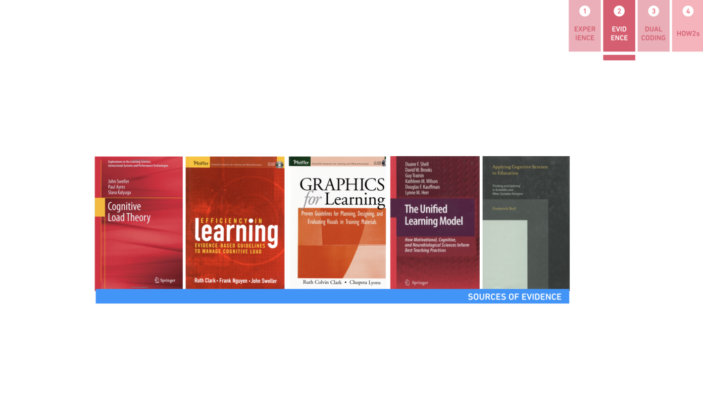
This slide shows the books I have been reading these past few months on cognitive science/psychology that have influenced my thinking. Their references are in the handout, which you can download below.
I have summarized every one of the 17 chapters of Sweller et al’s 2011 book into both sketch notes and a corresponding PDF presentation slides (that can be imported into your PowerPoint document if needed). Here’s what they look like:

You can download the Cognitive Load Sketchnotes here.
Handout
Here is the one-sider handout for my presentation.
Presentation Slides
Here are my presentation slides for the 35 minutes slot.
A version of this post previously appeared on the teachinghow2s blog.
References:
(1) Sweller, J., Ayres, P., & Kalyuga, S. (2011). Cognitive Load Theory. New York, NY: Springer.
(2) Clark, J. M., & Paivio, A. (1991). Dual coding theory and education. Educational Psychology Review, 3, 149-210.
(3) Moyer, D. (2010). The Napkin Sketch Workbook, Blurb.com
(4) Mayer, R.E. (2004) Foreword. In Clark, R. C., & Lyons, C. Graphics for Learning. San Francisco, CA: Pfeiffer.
(5) Russell, B. (1923). Vagueness. The Australasian Journal of Psychology and Philosophy, 1, 84-92.
(6) Reif, F. (2008). Applying Cognitive Science to Education. Cambridge, MA: MIT Press.

